Nothing like a global pandemic to inspire a company rebrand. While self-isolating and continually pondering the future, the past, and those highly unstable present moments, the idea for a rebrand surfaced as an optimistic opportunity to show resilience, emerge anew, and harness what we believed to be our strongest assets.
The pandemic was not the only catalyst, however. In many ways, it was just time. 2020 marked our 16th year in business and we had never gone through a formal brand evaluation. Our name had changed over the years and it had lost its meaning. We also had this really great internal culture that we didn’t want to lose, yet we had no way of defining or capturing it in a way that would align and guide our growing team.
We had also just brought on our new Director of Brand Identity, Robby Prall. While we may have eventually gotten to a rebrand ourselves, once Robby was on board his persuasiveness paralleled his creative talents and his gentle shove was just enough to set things in motion.
Here is our story….
First, what exactly is a rebrand?
One common misconception is that a rebrand is focused solely on the visual identity — the logo and associated collateral. While this is certainly part of the process, a successful rebrand should be more heavily weighted on a brand’s strategy: mission (what you do), differentiators (how you do it), and purpose (why you do it). Robby defines a rebrand as, “A necessity when your brand strategy isn’t aligned with your business objectives or when that alignment needs to be strengthened. Then, as a result of the rebrand, the visual identity should be redesigned to support and communicate the new strategy.”
One common misconception is that a rebrand is focused solely on the visual identity
Step One: Research + Audit
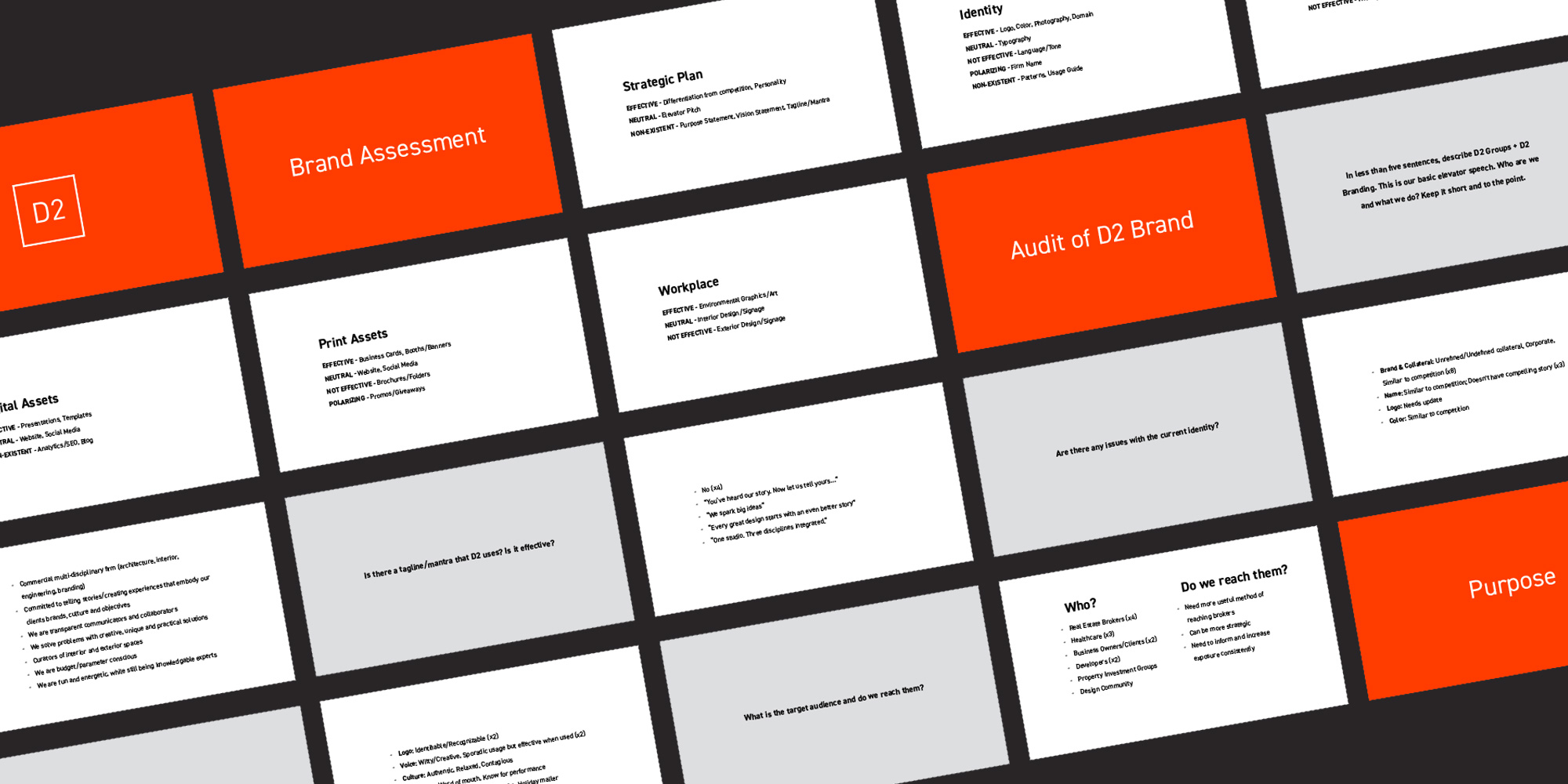
This is a critical step in understanding a brand’s current state, facing reality, and recognizing what needs to be done. We looked at our market perception, our current internal culture, our website, our sales collateral, and our social media accounts. It became instantly clear that our brand wasn’t reflecting our company goals and values. We identified misalignments in our messaging and noted where we were presenting ourselves in a way that conflicted with who we really were.
Here are the main struggles we uncovered:
Our name had lost its meaning over time. While recognizable, we found it challenging to explain why we chose it and what it represented.
We had visibly aged. In reality we’re a highly creative, engaged group. We love what we do and we love who we do it for. But our brand didn’t express that. It had gone a little safe and we’d lost our visual edge.
Our multiple disciplines were fused internally by teamwork, collaboration, and process. But externally they felt segmented and confusing.
Step Two: Developing a Strategy
Robby then developed a thorough questionnaire to get everyone’s raw and honest thoughts out in the open. We completed individual assessments first, which Robby compiled and analyzed before engaging us in a full group discussion. The goal of the group discussion was not just to find the flaws in our current strategy, but also identify where we had unified ideas and agreed strengths. We specifically and separately tackled who we were internally and externally (which, yes, can be different in some cases) and, lastly, how we wanted to define and express ourselves via our messaging. Here are the key elements of the new strategy that were born from that discussion:
Our name. It had built too much equity to change it, but its meaning needed to be addressed.
One Studio. One Objective. Our tagline of “4 Disciplines, 1 Studio” felt too disjointed. Our new brand needed to focus on our collective knowledge, creativity, supportive culture, and ability to deliver great outcomes for our clients.
Design is not a luxury. This simple statement became the external expression of ‘why?’ we do what we do – “We believe that all people deserve the advantage of informed design in their everyday lives.” Design impacts the world in huge ways: it makes processes easier, affects mood, influences decisions, improves healing, unifies communities, embraces diversity. It is not just for the few. Design – informed design, that is – is for all.
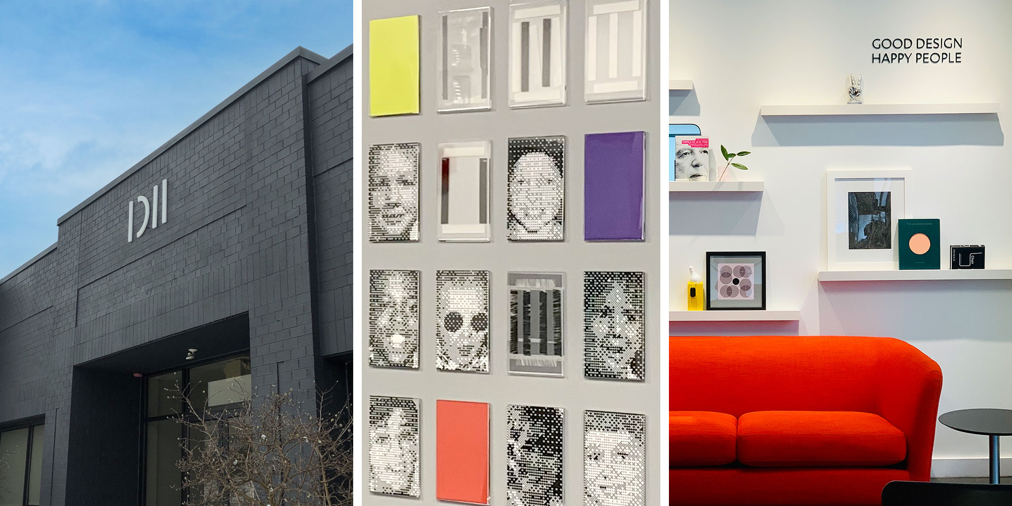
Good Design. Happy People. We didn’t want to overcomplicate our corporate values by trying to drive new behaviors. Instead, we focused on what makes our culture thrive – which is ultimately being authentic, working hard, keeping things in perspective, and enjoying our time together.
Simplicity is an art. Design can be a complex process. Required decisions are aplenty, schedule changes are common, and coordination is time-consuming and sometimes clunky…even the most experienced client can become overwhelmed. We developed this statement to embody our drive to make the design process easy to navigate for those within our own studio, our clients, and project partners.
Adaptability. Our ability to quickly and strategically shift our approach to accommodate project needs – both internal and external – quickly became one of our top differentiators.
Our voice. Our goal was to, again, capture our true selves to communicate externally in a way that represented us. We identified the characteristics of our internal personality that we would unite to form our voice – chill, informed, and witty.
The above is just a glimpse into the many ideas that were then compiled into a Brand Platform — which is a guiding set of principles for our brand moving forward. The platform contains our mission, internal values, and brand attributes to help guide the strategy. It also defines our personality and voice to establish core messaging. It is a resource for our leadership and our employees, ensuring that we share a common purpose and are all aligned with the objectives of the business – strengthening culture, decision making, and our collective voice.
Step Three: Finding a Visual Self
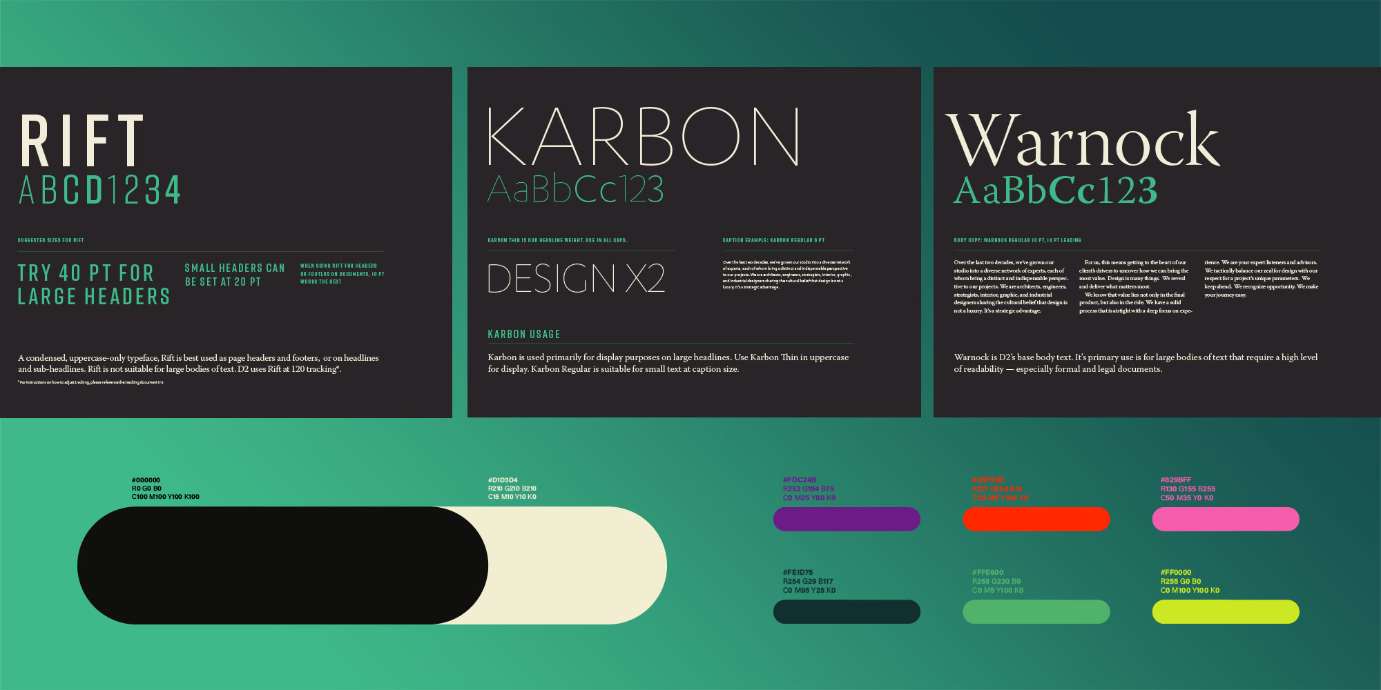
With our brand platform in hand, we pivoted towards our visual development. To kick off the process, we just played a fun card game! The objective was to narrow hundreds of visual cards down to a select few that would become the inspiration for our new logo, colors, and overall aesthetic. The catch? We all had to agree on the final selections. After the hard work of building our strategy, this visioning session was a welcome opportunity to get creative and decompress.
Once our visual strategy – the look – was established, we had a base with which to build our visual identity – the logo, color palette, and fonts. A visual identity should always have a story that relates back to the brand strategy – a meaning behind the look. A strong visual concept not only conveys the company name it represents, but also that company’s story, personality, and purpose. A visual identity that doesn’t communicate the brand strategy is a huge missed opportunity to effectively tell your story and build brand recognition. Here is how we expressed our own story:
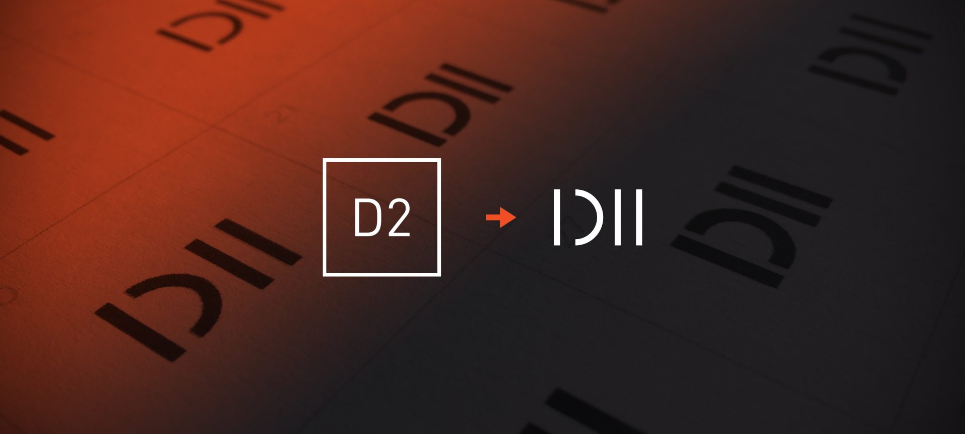
Our Name: In our strategy process, we brought a renewed purpose to our name. The ‘D’ in D2 has represented ‘Design’ since our founding. Our definition of design is that it is both the end product (the design itself) and the process (our partnerships and ability to guide along the way). So, our name represents the emphasis we place on design as the creative deliverable and, equally, the journey getting there.
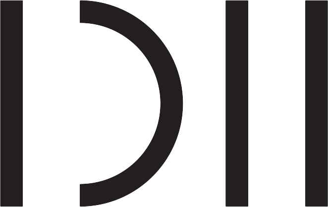
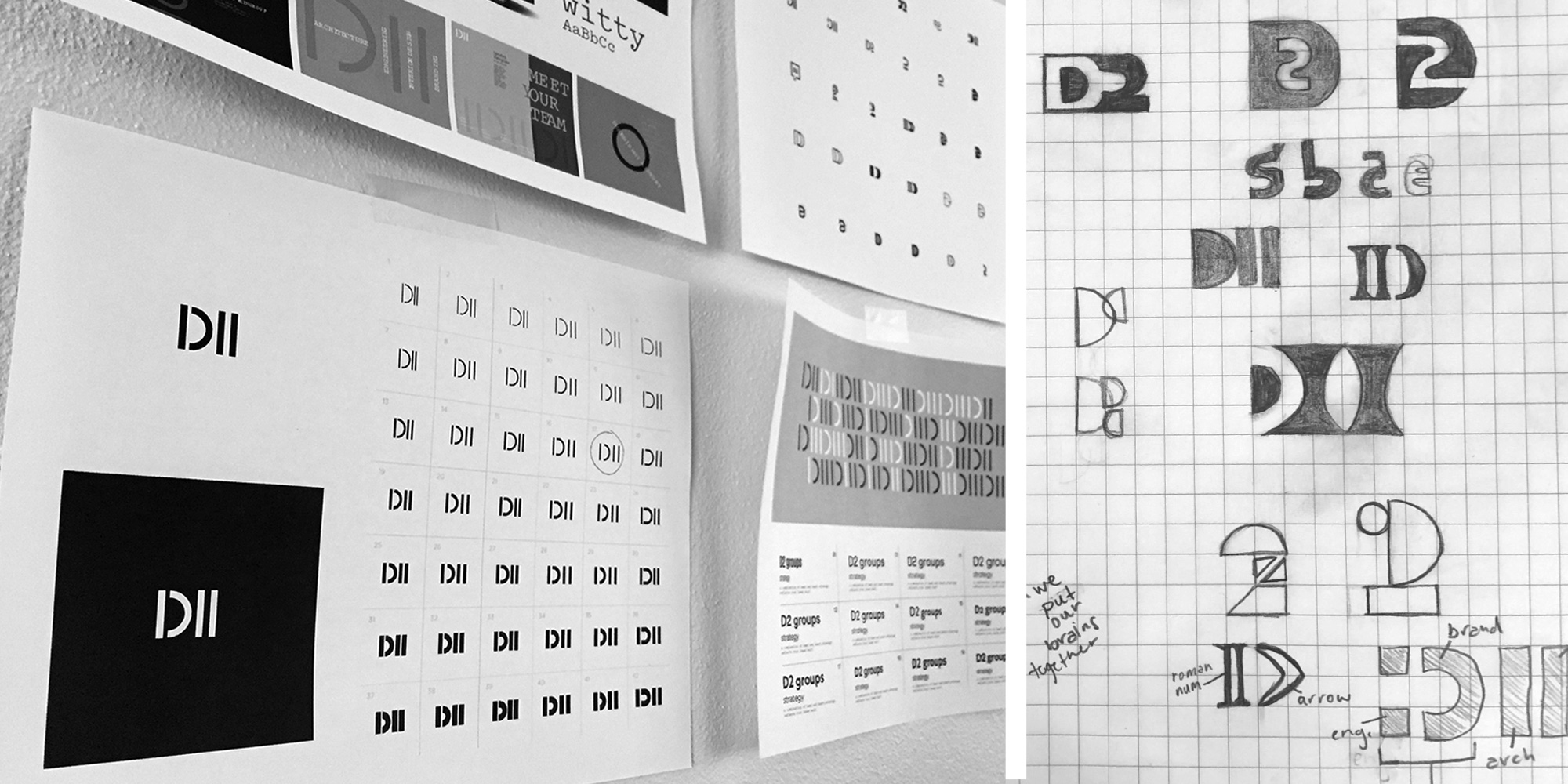
Our Logo: Adaptability in our processes became a leading differentiator in our strategy sessions and, in turn, a key inspiration for Robby when redesigning our logo. The visual expression of our name – our new logo – represents adaptability with three straight lines and one that bends. The story it tells is of our tried-and-true linear process and the strategic pivots, or bends, we embrace which can bring innovation, improve service, and create efficiencies.
Step Four: Turning the Strategy into an Experience
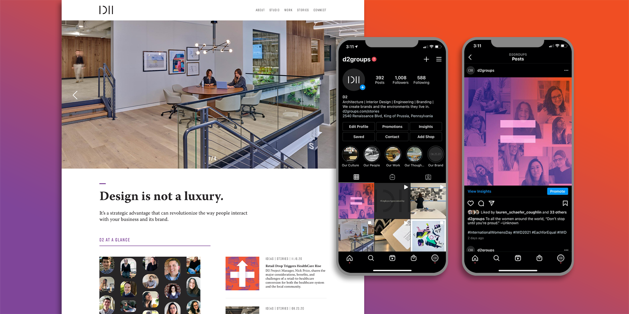
Once all decisions are made, the implementation process commences in full force. This is the opportunity to turn the logo, colors, and perfect series of words and messaging into a memorable and impactful experience. As Robby says, “Utilizing the foundation of the brand’s identity to tell a consistent story is critical. Inconsistency at this stage can lead to confusion both internally and externally.” Alignment is everything. A rebrand demands the overhaul, or at least review and analysis, of all methods by which your brand will be expressed.
The assets a company implements will vary depending on their industry, message, and target markets. For us this included:
• Injecting our new messaging and look into our website, allowing our new strategy to shine!
• Implementing our brand into our workplace environment to enhance our own internal culture and brand alignment. As we host a lot of visitors, our space has a huge impact and influence on our brand’s perception.
• Revamping the way we speak and express ourselves on social media, using these platforms to showcase our values, expertise, and personality.
• Developing a strategy to frequently share our ideas and knowledge on our blog.
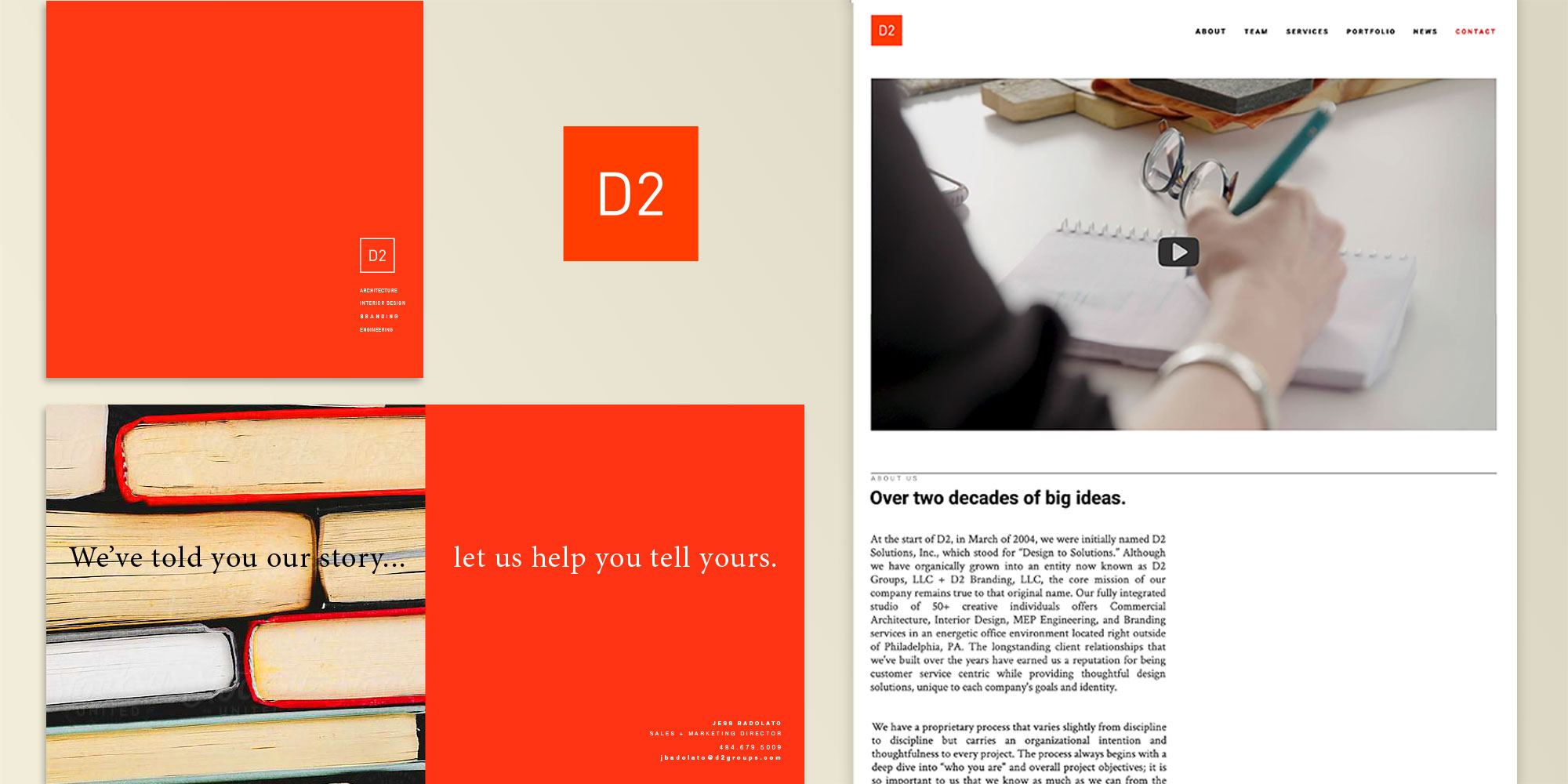
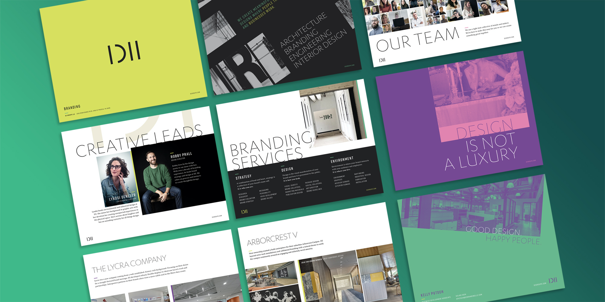
• Redesigning our sales collateral to better tell our story and reflect the new brand.
Looking Back and Ahead
A brand is always in constant motion. As we set our focus on a post-pandemic future, many businesses will need to reevaluate their brand. For us, in addition to a shiny new external suit, the rebrand has been a bridge for communication, strengthening our internal culture in a remote world. For other businesses, their services, operations, and culture may need to evolve to stay relevant, be competitive in new markets, or distinguish from the competition. Now may be the time for your business to act. Let go of what is no longer bringing value and harness your greatest assets to also emerge anew.
You may also enjoy…
Utilizing Design Standards to Boost Unity While Maximizing Originality
